Why is my chart delayed, showing question marks or only partially populated?
Background:
What are SMART Charts and how are they generated?
The SMART charting mechanism analyzes and compares the market data coming from all venues a given contract is traded on and graphically displays the most favorable quotes.
When all the data streams are live, the data points are available for all sources and for each time point, thus they can be fully compared. The resulting SMART chart will be up to date and fully populated, moreover it will constantly and automatically update1.
The comparison between non synchronized market data streams (some live and some delayed) is just partially possible, since the delayed feeds are lacking data points for the last 15 or 20 minutes. Therefore, within that time frame, the SMART chart will usually display a series of yellow question marks to indicate unavailability of source data. In this case the SMART Chart will not update automatically.
When the lack of data points is more extensive or when the Exchange does not distribute delayed data for a given contract, the correspondent SMART Chart may be completely blank.
What should I do to obtain a fully populated, up-to-date chart?
If your trading method is based on SMART charts, you would need to activate the live market data subscriptions for all the marketplaces your financial instruments are traded on2. For additional details, please see KB1201
If your trading method does not require SMART charts, you can decide to use Direct chart routing as a workaround.
A Directed Chart will allow you to graphically represent the market data coming from a single, specific Exchange. When possible, we suggest to select the primary marketplace for the product for this purpose, since this is usually the one offering the highest liquidity and trade volume, hence normally providing the most favorable quotes. If you have subscribed the market data for that venue, the resulting Directed Chart will be fully populated, up to date and it will update automatically1.
How do I set up a Directed Chart?
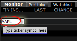
1. Within a watchlist, type the contract symbol and press Enter on your keyboard.
2. When then contract selection menu appears, select the item Stock (Directed). If you do not see this item, click on the small down arrow at the bottom of the menu to reveal the hidden menu items.
.png)
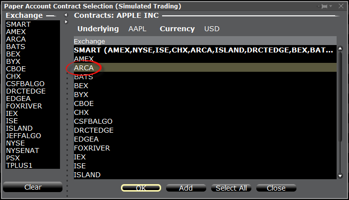
3. The Exchange selection screen will appear. You can now select the main Exchange for the product or the Exchange for which you have an active live market data subscription. Once done, click OK.
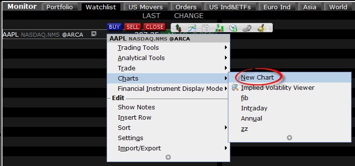
4. Within your watchlist you will see a newly created Directed Ticker line. It will contain the contract symbol and, preceded by the @ sign, the Exchange you selected at the previous step. Right click on that directed ticker line and select Chart > New Chart
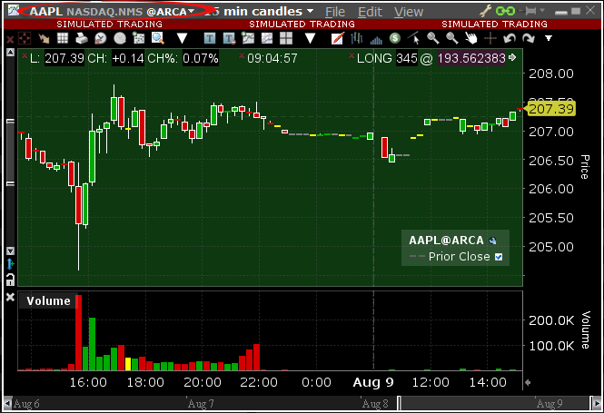
5. The chart will be shown. On the left side of the toolbar, after the contract symbol, you will see the Exchange you selected preceeded by a @ sign, indicating that this is a Directed Chart.
1. In order for the chart to update automatically, the checkbox "Keep chart up to date" has to be activated in the Chart Parameters panel. The panel is reachable directly within the chart window, from the top menu Edit.
2. Alternative streaming quotes for EU equities are available to clients with non-professional or non-commercial market data subscriber status. The complimentary real-time streaming Best Bid and Offer and last sale quotes on European Equities will be aggregated from exchanges such as Cboe Europe, Gettex, Tradegate and Turquoise. The data will display in the SMART quote line and can be used to generate a chart as well. Users who would like to receive the full EBBO (European Best Bid and Offer) will need to subscribe to the individual exchange subscriptions.
How can I remove the yellow news arrows on a chart?
概観:
If you wish to remove the yellow arrows which denote news on your charts, follow the steps listed below:
From the Chart window, click the Edit menu option followed by Chart Parameters. Find the section titled "Highlight on chart". If you have the yellow arrows, then the box titled "News" will have a check mark in it. Click on the box to remove the check. Once the check is removed and the box is empty, click the Apply button, and then click the OK button. The yellow arrows should no longer appear.